Saturday 30 October 2010

Long Exposure Experiments

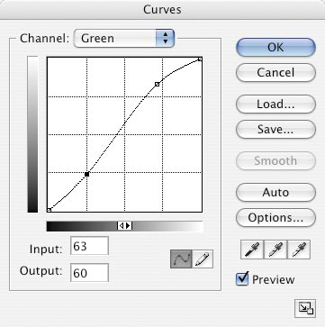
After looking at the modes and their uses on my Canon EOS 450D, I decided to experiment with the length of exposures. I have read in numerous photography magazines how to create light trails and I wanted to try it for myself, so I went with my friend Helen Kuchta who is a photography student at Coventry University, and took some images on a bridge over Atherstone bypass, so the passing cars can create the light trails. We took a tripod so the light trails would be straight. We went at approximately 11pm so it was dark enough to create effective light trails.
I set my camera to manual mode, enabling me to alter the shutter speed and set it up with the tripod. I initially set it to 13 seconds and got these results. I do like these images, particularly the first image because the light trails illuminate the road enough to keep a contrast between the two. With the second image, I experimented with shooting from an angle, but because of the length of the exposure and the amount of cars that came down the road during the exposure, the trails weren't as effective.
I then tried a shorter shutter speed of 6 seconds because I found that the surroundings didn't have enough contrast. Also, with a shorter exposure, there can potentially be more interest if there were numerous cars. I think this image is more successful as there are more light trails, therefore creates a more interesting image.
I took the camera off the tripod and decided to have a go at practicing a steady hand. I held the lens with my fingers underneath to create a steadier image as well as resting my elbows on the railings. This is the result. Although it is initially unsteady, the line is fairly straight. I see this as a real achievement because before this experiment I didn't have a steady hand at all but I will continue to practice holding my camera like this as it creates a much sturdier base and a more focused image.
I am pleased with the results of my experiments with long exposures and would like to continue this on another occasion in a different location; somewhere that is much busier, therefore creating more light trails and a more interesting image.

Wednesday 27 October 2010

Carpaccio Magazine

Carpaccio magazine is an independent online magazine that puts together up and coming artists, photographers and illustrator's work. Each issue is based around a particular theme and artists submit their work based around the particular theme. The people behind Carpaccio magazine then selects the best work from the submissions and publishes them. The magazines are available to buy in print online but are limited to approximately 100 each issue.
I looked at the art in the magazine, particularly the photography, and felt that my work would suit the general feel of the magazine, so I decided I would have a go at submitting some work. This is the submission brief:


  • Issue #21: “All we have is this free fall”. This issue is inspired in “The long fall” Marlango song. This issue will be Carpaccio Magazine last issue published in 2010, so we want to celebrate all we have learnt keeping on with this project, all the friends we have made, all the awesome artists we’ve had the honour to know,… Lyrics:


  • “Make it long and take it slow / All we have is this free fall. / All we have is this long fall.”
    This issue will be published on 14th December 2010.
    Deadline: 15th November.

    I started my research by listening to the song and writing down initial ideas for compositions and subject matter. I knew instantly it would be figurative because of the emotions attached to the song. I also looked at the lyrics and drew inspiration from them by looking at each line of interest and writing suggestions on how to depict these through subject matter.
    I then looked at magazine adverts for further inspiration for composition ideas, as my idea wasn't quite clear enough in my head.


    I then went back to look at past issues of the magazine to see how the work related to the brief. Many of the works seemed completely unrelated to the brief but were still visually stunning. This made me more relaxed, so I can concentrate more on the aesthetics as opposed to the meaning of the pieces I create.

    I came across Aaron Feaver, a photographer who's work has been published in Carpaccio magazine. I was instantly drawn to his figurative work and their poses. I printed off the images that inspired me most so that when I am doing my photo shoot and I need some inspiration, I could use these as a point of reference, making sure I'm not recreating his work.

    Black+White Photography Magazine Assignment

    I read Black+White Photography Magazine's assignment and thought I would have a go. The assignment was to create a series of low contrast black and white images of nature during the Autumn season. As this assignment is out of my comfort zone (I prefer to do figurative images with a slightly raised contrast) I felt that it would be perfect for me to experiment with alternative looks and processes. So I went for a walk in my local area and took many photos of natural forms such as: leaves, berries, conkers, apples, flowers etc and in a few I tried to depict how the seasons affect them visually. The magazine also gave a hint that weather shouldn't be an issue when taking the images; any weather is suitable.
    I took this into consideration and took an image of a leaf after it rained, showing water droplets on its surface. I like the detail in the water droplets and am fairly happy with the composition. This image didn't translate as well with a low contrast because I took the image when it was quite sunny, so the contrast was quite high. When I edited the image, I found that lowering the contrast too much made the image looked very washed out and the detail wasn't as clear, which I think made the image stand out.
    This image is one of my favourites because I think the black and white conversion and low contrast really compliment the subject matter. I took the image without looking in the viewfinder because I couldn't get close enough so took a risk and shot it without looking. Considering this, I think the composition is okay but could be improved.
    This is another candid shot, but again I feel it works well, although I could do with a little more room between the bottom of the image and the conker. Like the leaf image, this was taken when the sun was shining so there was a higher contrast before I edited it, making it more difficult to create a low contrast effect without washing the image out and losing detail. On the other hand, I think the contrast in textures in this image work well together.
    My final favourite image is of the berries. This was taken on an overcast day so the light was quite dull, which made an easier and more effective contrast alteration. I think out of all of the images, this one works best because of the fact that the image was already quite dull. I also think theres more interest in this image because of the numerous berries, giving the viewer more elements to look that, where as the other images don't have many focal points.

    Doing this assignment has benefited me because I have tried something different and out of my comfort zone. Although some people may not agree with me doing this, because I have to develop my own distinct style, I think it is important to explore other ideas and processes in order to come up with an individual loo. I didn't feel entirely comfortable with this style of photography as my main inspiration is from figurative and conceptual photographers, but I have learnt new processes that may benefit me in future work.

    Monday 25 October 2010

    Journal Comparison Presentation Reflection

    Last Thursday, I presented my findings from the magazine comparison to the rest of the group. Because there were only two other members of the group in attendance, the presentation became very informal.
    I again, chose to present using only the magazines as props. This really worked with the amount of people there were in the group because everyone could see the magazines then. Before I presented, I bullet pointed my main points that I wanted to get across in my notebook and had that there as a prompt if I ever stuttered, this became useful on certain occasions when I ran out of things to say. I also bookmarked pages that I wanted to show the rest of the group which had something to do with my main points.
    I think my presentation went fairly well but I feel I may have said too much as the presentation felt very long and in places I felt that I was repeating myself. This could do with lack of preparation, as I didn't prepare as much as I did for the other presentations. This had a lot to do with poor time allocation; I didn't balance enough time for this presentation with my other work. In the future, I will make sure I allow enough time to work on bigger projects and be more careful with my time allocation.

    Magazine Comparison

    Black and White Photography Magazine


    Black and White Photography magazine is a monthly magazine that specialises in black and white photography specifically, which is a very closed subject. The price of the magazine was £3.99, which I think is reasonable for the content and average for other similar magazines.
    The magazine had many articles inside on contemporary and up and coming photographers as well as more popular and well known photographers. I think there was a good balance of this and every photographer needs to know about the greats but also needs to know about what is new.
    Inside the magazine, there was also lots of other useful information such as exhibitions available in the UK. Because all the exhibitions mentioned were in the UK, the reader had more chance of actually attending these exhibitions. I have come across many magazines that show exhibitions worldwide and the only ones available in the UK are in London. This makes it very difficult for readers who live elsewhere in the UK to get access to the galleries. They give information on dates and addresses of the galleries as well as what the exhibition is about. All the exhibitions discussed are only on photography, which fits in with the purpose of the magazine.
    The magazine also has readers pictures. The magazine gives the readers an assignment each month with a cash prize for the winner and their work will be printed in next months issue. I think this is a really great idea and gives the amateur photographer a chance to have their work recognised.
    The magazine also has 'how-to' demonstrations, mainly using computer software such as Photoshop. This gives the readers the chance to gain knowledge in altering their images like professionals.
    Also, the magazine has many reviews on new equipment and towards the back their are many adverts related to the purpose of the magazine. Although for some people this is useful, I feel that it cheapens the purpose and makes the magazine one big advert.

    125 Magazine


    125 magazine is a fashion, photography, style and art magazine. The cover is very minimalist in comparison with Black and White magazine as it only lists the artists contributed inside and has an image that features in the magazine.
    The layout of the magazine is very different to B+W mag as there is a recurring theme of an colour panel image on one page and all the text on the opposite page. A good example of this is with the interview with Jenny Saville, where there is a large image of 'Stare, 2005' on the right and opposite on the left page all the text is almost squeezed on, as it is very small text. This, to me, seems like they are most interested in the reader only looking at the image and dismissing the text.
    The rest of the magazine is mainly full page image panels with small writing at the bottom of the page, giving detail of who made the garments in the photograph. The images are shown in a series and at the beginning of each series, there is a page detailing who was involved in making the pictures such as: the photographer, make-up artist, model etc. Even though the images presented  predominantly have a purpose of advertising, they are not like normal adverts as they have more of a concept and are works of art in themselves. I really like the pieces presented in the magazine but in order to know more about the artists, you would have to research them after reading the magazine.
    Because the magazine isn't only for photographers, they had to keep the content fairly open so that it would appeal to those who were buying it for the fashion or style element. This is very different in comparison to B+W mag, because the purpose is very refined for a particular audience.
    Both of these magazines are useful to me, but in different ways. I personally would use Black+White Photography magazine for the 'how-to' articles and possibly the assignments in  my personal work. Also, I found the exhibition section very useful as I actually attended one of the exhibitions through this magazine.
    With 125 magazine, I haved used it and will continue to use it for inspiration when I'm stuck for ideas for images.

    Sunday 24 October 2010

    Lomography Effects


    After researching many artists, they seem to be using a lot of different toy cameras. I have researched each camera of interest and how they get the effects shown.


    This image was taken on a Diana F+ Mini. With this camera, it is possible to go back to other frames and take another shot over another shot, creating a double exposure. This can be done many times but if too much light is exposed it is easy to ruin a frame. With any camera like this, there are great risks because the camera is only plastic and there can be a lot of light leaks which can ruin a whole film. These cameras are temperamental but as you can see here, you can get some really nice images from these cameras. I really like the way that the face of the figure almost merges in with clouds in the sky.


    This image was again taken with a Diana F+ Mini. Most holga cameras take 120 film but the Diana mini takes 35mm film. Because holga images tend to be square, there is an option whether you have square or rectangular images. If you choose the rectangular option, you can have two images per frame. For this image, the rectangular option was chosen and two images were taken on one frame. With this option, you can take two images that compliment each other and create unusual compositions.


    This was taken using a Super Sampler camera. This particular camera has four lens and they shoot in canon. The time between each lens taking an image can be adjusted so more movement from the figure can be done. In this image, the canon time was very short so all the images of the figure appear the same. I really like this look because again, similar to the rectangular option on the Diana Mini, you can get some really interesting and surreal compositions.


    This image was taken using a fish eye camera. This camera takes a rectangular image and warps it to become a circle. I really like this effect but it doesn't seem to be as versatile as the Diana mini and super sampler because there is very little you can do in terms of unusual composition. Also, the effect isn't always as visible  as the others.

    The Dust


    I came across these series of images whilst reading Snap online magazine. These images were photographed by Olivier Valsecchi, a french conceptual photographer. The images above are from a series called The Dust and are based on "Ovid’s definition of Chaos, who describes it as the confused mass (light and darkness, order and disorder, liquid and fog) that exploded to give birth to the elements that it contained."
    Although I don't normally like imagery like this because I find it too posed and too deliberate, I think with the concept, these images are both visually stunning and have a defined meaning.

    Saturday 23 October 2010

    Cross Processing


    With many artists I have looked at recently, they use cross processing techniques to create a more surreal look. I looked up how to get the desired effect properly without losing any detail and overkilling it. I first opened the image into Photoshop and then cropped the image so that the composition looked better. I then opened a curves layer and altered the layers as suggested below.

    Cross Processing in Photoshop - color negative art effectCross Processing in Photoshop - color negative art effectCross Processing in Photoshop - color negative art effect
    I duplicated this layer and altered the blending mode to luminosity and changed the opacity to 60%. This created a subtle contrast. I then added a solid colour layer with a green yellow colour. I changed the blending mode to colour and then changed the opacity to 10%, as only a subtle colour change is needed. I am quite pleased with my final piece but I still feel it isn't quite the aesthetic I want to achieve. I will carry on experimenting with this technique until I am happy with the outcome. 

    Chrissie White


    I also found out about Chrissie White on Carpaccio online magazine. Her use of colour tones are very similar to Li Hui's but White's work is more surreal with the use of photoshop to create unusual and magical compositions. I particularly like the first image of the girl flying through the window. I love the lack of light in the room in comparison to the light from the window. Again, I really like the colour tones of the image. In the second image, I like the use of outer glow on the 'fairy dust' to make it look as though it is glowing. 

    Rankin


     I have been fond of Rankin's work for a few years now and quite often look back at his work for reference and inspiration. rankin is a contemporary photographer who has taken photos for many celebrities, even the Queen.
    The two images above are from a series of his called Destroy. Here, he has given the artists in the image a copy of their portrait and given them the freedom to "destroy" it how they like. I particulraly like how The Gossip (top) have used marker pens over their faces.

    These two images above are a real contrast to Rankin's typical work. He mainly works with digital media but here he goes back to film-based photography. Also, his portfolio is portraiture based but here he photographs nature. Even though they are images of nature in film, they are actually commercial images as they are for an advert for beer.

    The image really stands out to me as it reminds me of imahes of Bettie Page by the beach. Here, Heidi Klum is not in the studio, she is on location but still there is artificial light to create a high contrast image. Also, the image has been desaturated because the colour tones are fairly muted.

    Li Hui


    I came across Li Hui in Carpaccio online magazine. I was instantly drawn to her work because of the way she makes digital photography look like film. From what I can see, I think she uses a combination of cross-processing, filters, altering curves, a level adjustments on Photoshop to create this particular look. I think this combination makes a nice surreal looking image and the use of navy blue and cream tones creates an almost timeless look, like there's no real identity in terms of time. Her work could easily be mistaken for being conceptual film-based images from decades ago.
    I really like how most of her images are low contrast. This is quite a comparison to other contemporary work which tends to have a higher contrast to create a more dynamic image. With Hui's work, she gets the same reaction with low contrast effects. I also like how her images never reveal facial features, creating lack of identity for the figure in her images. This obviously isn't typical of portraiture work as identity tends to be key. She may do this to create a mystery within the image or so that the viewer may feel some relation to the figure.  

    Composition Practice

    Recently, I have been watching Channel Five's "How to Take Stunning Pictures". I was particularly interested in the first episode on portraiture, where photographer Harry Borden gave tips on taking better portraits. I took these tips into account and started shooting portraits for myself.


    With these images, I tried to use the rule of thirds, with my grandad and the fruit machine in the background being on the dividing lines. I also used natural light to light the composition. I like the way the light caught one side of his face, creating quite dramatic lighting. I converted them to black and white because I feel they look more sophisticated and seems to suit the lighting well. I did this using Photoshop, first desaturating the image then altering the levels. I think to get a more accurate black and white conversion, I will look at other artists and how they convert to black and white.

    These images were initially taken spontaneously. My grandad was not aware of the first image, showing a very natural pose. With the second pose, he looks more aware of me yet still fairly natural. With the third image he is fully aware of me taking photos and starts pulling funny faces. Even though he is posing, this really reflects his character. This uses both of Harry Borden's techniques. His best work are a mixture of both posed and spontaneous images.
     This is an example of Harry Borden's posed images. This is a portrait of Adrian Brody. As it is taken in a studio, they tend to be very posed because there is full intention of achieving a portrait, where as spontaneous images tend to be lucky shots.
    This is an example of what Harry Borden considers to be a lucky shot.

    Friday 22 October 2010

    Start of my Foundation Degree Journey

    I started this course not feeling particularly nervous because I had met my peers prior to my first day. When applying for the course, my biggest concern was not gelling in with the rest of the group as I have had difficulty with it before. Because we met before the course started I felt more comfortable and I had been in contact with them during the holidays.
    I was a little apprehensive because I didn’t know how different a university course would be in comparison to the courses I have done before. I knew it would be more of a challenge and I was prepared for that but I didn’t know at what level, which made me nervous.

    I am confident with media such as photography and photo manipulation, but with photography, I would like to develop my skills as I am self-taught and would love some formal training and learn how to make the most of the equipment I have. Hopefully, this will help me take better images.

    As Art is my main interest, I have a lot of time for it and am constantly researching and getting ideas. I think this will benefit me as I have already gained a lot of information on artists, movements etc. that I can contribute to group discussions and add to research requirements in specific units.

    I am generally okay with most media types and have the ability to learn effectively and quickly, but I would like to expand my skills in painting and printmaking because these are two media that I have enjoyed in the past and have been neglected due to my great interest in photography and photo manipulation. Also, I am not particularly confident with this media and feel I could express myself with this media.

    I also think I need to work on my attitude towards certain subjects because I have a tendency of neglecting subjects I am not doing so well in and not as confident with. During the course, I will try to maintain a positive attitude to my work. Hopefully, this way I will learn more on my weak subjects and feel more positive about them.

    I would really like to take up photography as a profession because it is a subject that has been a major part of my life ever since I was young when I had my first camera. I was constantly taking photos and I still am today. I really love the finished product and I feel most comfortable with this media. Other people who have seen my work have complimented my work and this has given me the motivation and reassurance that I could be successful in this industry. I would ideally like to work for myself as I am a very independent person and really enjoy doing my own personal projects. I particularly enjoy taking street photography, mainly because of my love for Robert Doisneau’s work. I also really enjoy portrait photography, especially spontaneous shots as they tend to capture the true character of the figure.

    I am not entirely sure on what I want to do as a career once I have finished this course. I would like to go straight into a job that relates to my love for photography because I feel I have the capability to be successful in this industry. I am hoping that this course will teach me how to approach going into this industry.

    Thursday 21 October 2010

    3D Object Presentation Reflection

    I presented my guitar to the other class members and described to them the significance of the imagery to me. This presentation was more relaxed and informal as it was more of an exercise to get to know each other. This made me feel more comfortable as it didn't seem like as a big a deal and I felt less pressured to get everything right. As we had longer to get to know each other before the presentation, I felt more comfortable presenting my work in front of them because I knew they wouldn't judge and would listen to me. I also used another presentation technique by simply describing my object and not using PowerPoint. This was a start to practising alternative presentation technique, even if it is very simple. Also, I could use this technique because I'm presenting to such a small amount of people and everyone can see what is on the object.
    It is difficult to say whether this presentation went well or not because it is not a typical presentation. No real research was done, all I had to do was describe my object and myself. I suppose I did well because I had confidence in my object and what I was going to say about it and I answered any questions that were asked.

    3D Object

    Another task was to create a 3D object that represents me. I brainstormed my ideas and came up with aspects of my life that I want to include. They included: family, photography, favourite films, favourite musicians, places and lyrics.
    For the 3D object, I came up with the idea of decorating an old acoustic guitar that has been in my house for years and hasn't been played; I wanted to give it a new life. This will also relate to the fact that I like my work to have a purpose and I like to upcycle old things and give them a new purpose whilst being decorative. Also, by decorating an acoustic guitar, it will instantly reflect my love for music as well as the kind of music I like; relaxed chilled out acoustic music.
    I would reflect my other loves, interests and aspects of my life by collaging different items to represent each thing. I used a variety of media including: photographs, paint, pencil, felt pens, correction pen, markers, fabric and buttons.
     I first paper mached the guitar on selected areas so it was easier for me to decorate the guitar but so that it is still recognisable as an actual guitar and not a model.
    I then painted the paper mached areas with my favourite colours. I chose a series of colours to add more interest as opposed to one or two. I added a black border around it to finish it off. Then I decorated the object using photos from a previous project (relating back to the recycling aspect of my work) and images that I found in magazines and printed off the Internet.
    On the front, I had a flower I made from fabric representing my hobby of sewing. I also had images of my brother, sister, mum, dad and my boyfriend as they are very important people in my life. I also had an image of Krishna. This represented my love for Hinduism, even though I don;t practice it. He also is the most popular figure with aspects of devotion in the religion. This ties in with the devotion to my family and their devotion to me.
    On the back are my loves. I have put an image of my camera because my man hobby is photography and also reflects my ambition to pursue a career in photography of some sort. I also have images of Smeatons Tower in Plymouth, Lichfield Cathedral and the Eiffel Tower in Paris. Smeatons Tower in Plymouth represents where I used to live and grew up. Lichfield Cathedral represents where I live now and the Eiffel Tower in Paris is where I would like to live because I really love the place and feel very at home there. I added stills from three of my favourite movies: Hook, Quadrophenia and Drugstore Cowboy. I have images of each of the Beatles, as they are my favourite band. I also have an image of Rufus Wainwright, who is by far my favourite musician and has been a massive influence on me. I have written my favourite lyric from my favourite song Across the Universe, by the Beatles and has been covered by Rufus Wainwright. I feel this ties everything together and also the lyric "Nothings Gonna Change My World" relates to my life. Lots of things have happened in my life and nothing is going to change my love for the things I have put on this guitar.

    Exhibition Presentation Review

    For my first task for this unit, I had to rpesent my review of the Edgerton exhibition. I decided to display it as a powerpoint presentation, mainly because I want to appear more formal. Also, I think it is very easy to watch esepcially when there isn't too much text and contains pictures that relate to the points I am trying to make, helping the viewer undersatnd my point. I first gathered my information and divided it into sections such as advertising and location. I made bullet points for each section, giving short detail as to what I wanted to say. These worked as a prompt for when I was presenting. I then made a slide for each of my key points, with images to help the viewers visualise my findings.
    I felt fairly confident with presenting my work because I have done many presentations in previous education. Also, because I had plenty of notes that were eay to read and written in sections, if I were to stumble, I could recover easily. Luckily, I didn;t really need to use my prompts as I had practiced the presentation a few times prior to presenting and felt confident without the notes. But it is nice to have that reassurance if anything does go wrong. I did feel slightly nervous as I was presenting in front of a new group of people with only six members. I am used to presenting in front of 30 or more people.
    I think the presentation went well. I answered questions with confident answers and my audience interacted with me and discussed my points, showing they had an understanding of my research. I think next time I do a presentation, I will use other presentation techniques and find other alternatives to powerpoint.

    Seeing the Unseen: Harold E Edgerton Exhibition Report

    During the summer, I went to see an exhibition of Harold E Edgerton's best work called Seeing the Unseen:Photographs and Films by Harold E Edgerton. The purpose of the this exhibition was to celebrateEdgerton's work.
    Harold Edgerton used photography primarily as a tool for his work as scientist, engineer, teacher and inventor. He invented a high-speed photographic process with stoboscopic instances of light or 'flash' to create a multi-exposure effect. This invention helped him capture movement.
    Location
    The exhibition was situated at a shopping unit in the Pallasades Shopping Centre in Birmingham. The shop unit was bought by Ikon Gallery, who organised the exhibition. I found it fairly easy to find as it was so close to the train station, but there wasn't much in terms of directions.
    Advertising
    I found out about the exhibition by searching on the Ikon gallery website. On there, it gaves details of dates but was very vague about directions. Other than that, the exhibition was fairly poorly advertised. There was only one poster advertising the exhibition which was situated by the train station, coming out into the Pallasade's shopping centre. Even then, it didn't give much information as to where the exhibition was located. As I frequently go to Birmingham, I have a vague idea of where things are and I used my previous knowledge to find the exhibition. For someone who wasn't familiar with Birmingham, getting to the exhibition would have been a problem.

    The exhibition design allowed a clear navigation for the viewers. As the door was to the right of the unit, we were navigated to the right wall with photographic prints displayed on the wall. The seating area works almost like a barrier, preventing you from going to the left side of the room, navigating you anti-clockwise around the room. Also, when I entered, I was drawn to the back of the room which displays many pieces in glass cabinets. The exhibition design does cater for wheelchairs and pushchairs until you get to the glass cabinets where there is very little spare room as well as going through the doorway to where the film is displayed. There is also a seating area in the exhibition room as well as toilets and cafes within the shopping centre.

    The Works
    The works mainly consist of photographs mounted in same size frames, which create a neat and cohesive look. They are attached to the wall with screws. They are displayed in their series, making the pieces flow more, creating almost a narrative. The problem with the presentation of these works was that the lighting glared off the gloss prints, which made it difficult to appreciate the prints fully as you could see your own reflection in the work.

    Written Material
    There was an array of written material available at the exhibition. There was atimeline on the wall, giving more detail on Edgerton's life. As well as this, there were three mounted posters on the wall, giving more information on the Ikon Gallery and events. Also, each piece had a label with the artist, title, dates and materials used for each piece. I was also given a leaflet from a memeber of staff, giving a general overview of the exhibition. There were also books available to buy, giving greater detail about his works.

    I had a friendly welcome when I entered the exhibition space and was given a general overview of the exhibition. As the exhibition wasn't very busy, there was onl me as a viewer, which made the experience feel rushed, like I was in the way. I felt to achieve the purpose of the exhibition, the space needed to be larger, allowing larger prints to be made,therefore allow the viewers to appreciated the intricate details of his work. Also, I think there needed to be more free information available as I found I had to research his work after my visit. It could be argued that the target audience for the exhibition was people who had a sdpecific interest in this area and were already aware of his work, but because of the location, in a shopping centre, I feel that the exhibition was open to the general public and more information should have been available for the work to be appreciated and understood by all.